Saturday, August 30, 2008

Hurricane Gustav Tracking on Google Maps

This post is an update to Hurricane Fay Tracking on Google Maps. Hurricane Gustav is currently moving towards the Cayman Islands and the Gulf of Mexico.

the path of Hurricane Gustav

If you need help on viewing the path of Hurricane Gustav these Google Maps should be able to help. All the sites are tracking the hurricane and are showing its forecast path.

IbiseyeWundermap
FLHurricane.com
Firstcoastnews.com

Mibazaar has produced a map showing the projected path of Hurricane Gustav and also the latest YouTube videos tagged 'Hurricane Gustav'.


The Google Earth Blog has a post on Tracking Hurricane Gustav in Google Earth and has produced a network link for a number of different weather tools.

Update:
Google have also just announced that they have added a "Hurricane Gustav" folder under the "Weather" folder in Google Earth.

________________

Friday, August 29, 2008

Google Maps Updates

Good news for mobile phone users. Walking directions are now included in the transit directions provided in Google Maps for Mobile.

Google will also soon be receiving satellite imagery from a new source. GeoEye Inc says it will be providing satellite imagery from its $502 million high-resolution satellite to Google Earth and Google Maps. The satellite is due to be launched on September 4.

GeoEye Inc say that the new satellite will be the world's highest resolution commercial earth-imaging satellite, providing images at 1.65 meters resolution in colour.

Google will continue to use imagery from other sources as well.

________________

Friday Google (and other) Maps Fun

If You Are A Cow Turn to the South
Scientists claim that cows and deer tend to align their bodies in a north-south direction when they are grazing. The researchers surveyed Google Earth images of 8,510 grazing and resting cattle in 308 pasture plains across the globe and found to their surprise that the animals tended to face either north or south.

Interestingly my own exhaustive study of exactly one image of elephants suggests that pachyderms tend to align their bodies in a west-east direction.

screen shot of google map satellite image of some elephants in Africa
Via: BBC


Happiness Map
happiness map
Denmark is the 'happiest place on earth' according to Adrian White's Happiness Map (pdf).

Map Making
Mapperz informs me that India has been added to Google MapMaker, which seems appropriate as I think Map Maker came out of Google's Bangalore offices.


Whilst on the subject of map making I think Google should check out the map making interface in Far Cry 2:

Thursday, August 28, 2008

Free Our Data - How to Do It Well

New Orleans Repopulation Map (dead link removed)
screen shot of New Orleans Repopulation Map
This map from the Greater New Orleans Community Data Center shows residential addresses actively receiving mail by census block in New Orleans. The mailing list data represents the number of residential addresses per block where the mailman knows someone picks up the mail.

The U.S. Census Bureau's methods for estimating population can't keep up with the extraordinary situation post-Katrina so looking at residential addresses actively receiving mail is one way that population can be estimated. The map shows the population density in June 2008, the darker the shade the higher the density.

CapStat Mapping (dead link removed)
screen shot of CapStat map
The District of Columbia's CapStat Mapping application was designed to allow citizens in the district access to local government data with a geographical focus. It allows citizens to access data on crime, public space permits, building permits, locations of schools and service requests from a Google Map.

The map is a great example of how government can provide innovative portals to public data. It is possible to search the map by address or by a number of different pre-defined areas, such as police district, neighbourhood or ward. It is also possible to search the data by date. For example it is possible to search 16th Street Heights for crime on the 26th August.

________________

Wednesday, August 27, 2008

The Unlit Tour on Google Maps

Orange Unlit Tour (dead link removed)


Over the last two years Unlit has toured the USA and the UK. The tour consists of free gigs which are open to anyone and take place in volunteer’s homes. The support acts on the tour are bands and acts who have become involved via MySpace.

Central to the tour is a Google Map mash-up which serves as a tour hub for singer-songwriter Jont and his sidekick film-maker Dave. The map uses the flash version of the API and pulls together videos from YouTube, photos from Flickr, updates from Twitter as well as blog posts.

Using the Flash version of the map API means that Unlit are able to include an animated welcome to the map and to customise the map controls. The map also includes a useful help window with tips on how to use the map.

________________

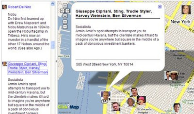
New York Google Maps Round-Up (8/2008)

Celebrity Owned Bars and Restaurants
screen shot of celebrity restaurants map
Everybody knows that the best chefs are actors and musicians. Now if you are in New York and you fancy an overpriced burger you can quickly find a restaurant with Cityfile.com's Celebrity Bars and Restaurants map.

The restaurants are tagged on the map with photographs of the celebrities and I'm sure the restaurants themselves are liberally splattered with images of their owners. Not that I'm suggesting that Justin Timberlake doesn't cook the best southern fried chicken in New York.

Unfortunately the map doesn't seem to include Steve Guttenberg's Steak House:

See more Steve_Guttenberg videos at Funny or Die


Diaroogle
screen shot of Diaroogle
Any connection between this map and the previous map is purely coincidental. Diaroogle is a community submitted map of Manhattan toilets. The site says that is is for "the discerning, on-the-go defecator who is brave enough to use a public bathroom, but still demands a hygienic and private bathroom experience."

Each mapped toilet tends to come with a general report on its cleanliness and occupancy levels. You can search the map by address, cross street, zip, Manhattan neighbourhood, landmark or park and probably most usefully can access the map from a mobile phone.

Best Parking
screen shot of best parking map
Apparently New York celebrity restaurants don't come with celebrity valets so you may need the Best Parking map. The map helps drivers to find parking garages and lots, compare daily and monthly rates, and book "Reservations" and/or "Rate Guarantees" at participating facilities.

A search facility allows you to narrow your search to a particular New York City (Manhattan) neighbourhood or address and then view the best parking deals on both a map and a sortable list.

Best Parking is also available in Boston,DC and Philly.

PrimoSpot (dead link removed)
primo spot map
Primo Spot is a map of free on-street parking spots in Manhattan and Brooklyn. The map markers are colour coded:
  • The green marked spots have the longest time remaining on them
  • Red spots are about to run out.
  • The black markers indicate the spot has no parking any time, no standing, or is for commercial vehicles only.

StoopSales (dead link removed)
screen shot of stoopsales
StoopSales is a Google Map mash-up of all the moving out, fund-raising and spring cleaning sales in Brooklyn. It is possible to search the sales by time of day, date, and neighbourhood. Registered users can post their own sales, with photos.

________________

Tuesday, August 26, 2008

Google Map of All Olympic Medallists

Supernifty Medal Map
screen shot of Olympics Medal Map
This Google Map mash-up shows where in the world all the Beijing Olympics medal winners come from. As you can see from the screen shot above there seems to be a fairly even distribution of medals around the world, although the southern tip of South America looks a little bare to me.

Clicking on one of the maps tabs reveals details of the individual medallists and provides a link to the athletes page on the official website of the Beijing Olympic Games. I have no idea if the map designers plan to develop the map but it would work well if it was linked to a database so you could select countries or different sports. A marker manager or clustering system would help as well. At the moment all the tags are loaded at the same time onto the map so slower computers may struggle with this map.

________________

QR Codes on Google Maps

QR Codes are two dimensional bar codes that can be used to store web addresses and other data in a form that can be quickly accessed by a mobile phone. Anyone with a camera phone equipped with the correct reader software can scan the QR Code and the phone's browser will automatically load the programmed URL. In this way locations in the real world can be linked to their on-line presence and, of course, to Google Maps.

QR Code for the Statue of LibertySemapedia.org
Semapedia connects Wikipedia articles with real world locations. To create a QR Code for a Wikipedia article you just need to enter the article's web address and Semapedia creates a PDF containing the QR Code that links to the article.

If you post the QR Code up at its physical location you will have helped hyperlink the world. Now when anyone visits the location they can point their mobile phone at the code and immediately be taken to the relvant Wikipedia article.

Semapedia has a Google Map of locations that have been hyperlinked in the real world. Each tag contains the name and the date of the tagger and a photo showing the QR Code posted on its location.

QRMap
a qr codeQRMap is a great tool for creating QR Codes for a Google Map centred on any location. You can then use the code to direct mobile phone users to a Google Static Map of your location. For example a night-club could put the QR Code on a flyer so potential customers could quickly access a map of the club via their mobile phones.

To create the QR Code all you have to do is centre the QRmap on a location and press the envelope at the top of the screen. QRMap then creates an e-mail with a tiny URL to a web address where you can find your QR Code. The QR Code can then be cut and pasted into any document.

QR Code Mapplet (dead link removed)
screen shot of QR Code Mapplet
The QR Code Mapplet lets registered users create a Google Map with an embedded QR Code. It is possible therefore to create a map that users can scan to get directions to a business, to get the contact details of a business on their phone, or to visit a mobile website or mobile blog.

If users point their phones at the embedded QR Code they can also create a bookmark of a mobile website or mobile blog on their phones or note down an address on the mobile phone, just as they would using a pen and a paper.


________________

Monday, August 25, 2008

Photosynth on Google Maps

Photosynth Map
screen shot of photosynth map
Soren Johannessen of Microformats.dk and the Danish contributor to Google Maps Mania has created an example Google Map that has Microsoft's Photosynth embedded within the information windows.

Photosynth transforms regular digital photos into a three-dimensional, 360-degree experience. Soren has created three Photosynths of different locations in Copenhagen, Denmark. When you click on a tag on the map you are then able to navigate around various views of the mapped location via Photosynth.

To view the photos you will need to download Microsoft's Photosynth plug-in. It is definitely worth downloading the plug-in as embedded Photosynths is a great way of exploring an area on Google Maps

________________

Walking and Cycling With Google Maps

Mlib'
screen shot of Mlib
French website Vlib celebrated its one year anniversary recently. Vlib is a great map mash-up that shows bike rental locations in Paris. Renaud Euvrard has created a mobile application called Mlib' that means you can now find bike rental locations on your phone.

It is fairly easy to find a Vélib station in Paris, as they on many street corners, however the stations are often empty. Mlib allows you to find the nearest kiosk with bikes to your current location. Mlib is very quick to load and the content has been kept to a minimum to ensure ease of use.

French speakers can read more about the application on Renaud's blog Renalid.

MapMyWalk
screen shot of mapmywalk
MapMyFitness, LLC has a host of fitness mapping websites. Google Maps Mania has previously reviewed MapMyRide and MapMyRun.

MapMyWalk allows you to plot your walks on a Google Map. Once you have mapped your walk you can view it in 3D with the Google Earth browser or on a Google Map and share it with your friends. Alternatively you can search for walking maps created by others.

The mapped walks feature a handy terrain view, so you can evaluate a walk's difficulty. It is also possible to embed a walk in your own website or blog by cutting and pasting a small piece of code.
TFL Cycling Maps
screenshot of TFL cycling map
London's Transport for London website has added a Google Map of cycling routes in London to its website. To search the map you can choose what type of cycling route you wish to see, cycling paths, cycling on quiet roads or cycling on busier roads. You then have to choose which London borough you wish to find cycling routes for.

Here in lies a big problem. Because you can only view one borough at a time, when a cycling route moves into the next borough you have to guess which map you need to load to see the rest of the route.

There also seems to be a problem with the map's search option. I tested the map with a route I regularly cycle that is possible without cycling on any roads. For some reason TFL advised me to ignore most of the cycle paths on the route and to take a longer journey on a number of roads.

TFL provide free paper cycling maps for London. At the moment these are a far better option for cyclists.

Via: Mapperz

EveryTrail
screen shot of evertrail
EveryTrail is a GPS mapping community site that features hiking and cycling trails. Currently the site has over 130,000 tracked routes in over 130 countries world wide.

Recently EveryTrail has implemented the Google Maps Flash API to display geo-tagged photos alongside the tracked routes. This new feature means that viewing tracks is now a very pleasurable experience and the photographs give you a real sense of the views you can expect on a hike or ride.

EveryTrail allows you to download a KML of a track to view in Google Earth or download a track to a GPS devise. You can also embed a walk in your own website or blog by cutting and pasting the embed code.

GPSies
screen shot of GPSies
GPSies is a website that allows users to track cycling and hiking routes which have been recorded on a GPS device. It is also possible to download any of the routes to a GPS devise.

Each tracked route can be viewed on a Google Map. The routes come with an altitude profile so it is possible to quickly assess its difficulty. Each track also comes with a number of user ratings for landscape, condition etc.


________________

Saturday, August 23, 2008

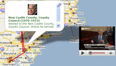
Map of Joe Biden's Life Journey

Joe Biden's Life Journey
screens shot of Biden's life journey map
Mibazzar, whose maps of Obama and McCain's life journeys feature prominently in Google's Elections '08 Map Gallery (dead link removed), has now produced a Google Map showing Joe Biden's life from his birth in Scranton, Pennsylvania to his nomination as Obama's running mate.

The map animates through the important events in Biden's life, creating a polyline from one event to the next. It is possible to turn off the autoplay feature and scroll through the life events manually. You can even scroll backwards to reread earlier events.

Expect another life journey map as soon as McCain names his running mate!

________________

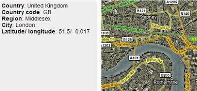
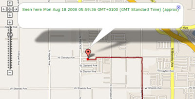
Two Ways to Find You

Google have released two new ways to find a web user's location without requiring any user input.

1. The AJAX API Property (dead link removed)
screen shot of where are you
The AJAX API Property retrieves an approximate location from a user's IP address. Google Blogoscoped has released an example Google Map that uses the AJAX API property to centre the map on the user's location and provide the results of an image search based on the user's location. 

2. The Gears Geolocation API (service now discontinued)
The Gears Geolocation API provides a way to get a more precise estimate of a user's location. On mobile devices with Gears installed, the Geolocation API can triangulate a location on nearby cell-phone masts to get a more accurate position fix.


Friday, August 22, 2008

Friday Google Maps Fun

The Original Sat-Nav

This wristwatch was invented in 1920 and allowed drivers to navigate around the UK. The watch used paper maps wound around wooden rollers. However because there were so few cars around the watch failed to take off. If you are in London you can check out the watch at the Weird and Wonderful Inventions exhibition at the British Library (until November).

Take the Road Through the Lake
screen shot of Google Maps driving directions
When you ask Google for driving directions from Gamètì/Rae Lakes Airport to Rae/Edzo Airport you are told to drive through the middle of a number lakes. The walking directions state you should "Use caution – This route may be missing sidewalks or pedestrian paths", which is a slight understatement when its -40 and and 197 km of only ice ahead. When do we get sledge directions?

The reason that the roads go across a number of lakes is because these are ice roads that are built every year across the ice. Check out the Ice Road Truckers website for more information.

Via: Mapperz

The Last Guy


The Last Guy is a game from Sony that is built on top of satellite imagery that looks very similar to Google Maps / Earth imagery (but presumably isn't). The game itself seems to be a 2D shooter.

Via: Very Spatial

The Street View Boat?

In Australia an expanse of water was not enough to stop the street view car.

Thursday, August 21, 2008

Breaking News on Google Maps

With both Obama and McCain set to name their running mates any minute now it seems an appropriate time to look at some of the Google Maps mash-ups that attempt to show breaking news.

Maplandia
screen shot of Maplandia
Maplandia has been geo-tagging the news with Google Maps since November 2005. Since its launch Maplandia has tagged more than 40,000 news items, connecting important events with specific locations on a Google Map. Now Maplandia have developed an interface to access this history.

With this update it is possible to browse world news on a Google Map for any day since January 2005. Furthermore Maplandia have created a separate news site for each country, so it is possible to browse the recent news history for any country you choose.

Finally, Maplandia also now offer the option to view the over three million locations listed on the site via the Google Earth browser plug-in.

Breaking News Map (dead link removed)
screenshot of the breaking news map
The Breaking News Map is an interesting Twittervision style map built with the Google Flash Maps API. The map animates between different geo-tagged news items, which means you can just choose what area of news you wish to read and just sit back and watch.

The news stories can be selected by category, for example, business, politics, entertainment, science, sports, technology etc. You can select just one category or as many as you want. It is also possible to select the speed at which the map switches between different news stories and to pause a story if it catches your eye. The map even comes with a fast-forward button so you can just zap through the news that bores you.


For many, many more news maps check the Current Events links in the right hand post.
________________

Wednesday, August 20, 2008

Map of Champions

EarthgamZ (dead link removed)
screen shot of earthgamez
EarthGamZ is a Google Earth browser map for the Beijing Olympic Games. As well as using the map to view the Beijing Olympic stadiums in 3D you can also check out the biographies of all the athletes taking part in the games.

It is possible to search the map by sport and country. It is possible therefore to quickly view the biographies of all the US swimmers. Each athlete is geo-tagged by their town of residence. Did you know, for example, that all the US beach volleyball players live on the Californian coast? Not that surprising I suppose.

Via: Google LatLong: Map of champions and The Google Earth Blog

________________

The VP Nominations on Google Maps

Veepstakes
screen shot of Veepstakes
Have the Vice President selection committees of the Obama and McCain campaigns thought about using Google Maps and Google Trends to help them decide on their candidate? Mibazaar has put together a Google Map of Google Trends and possible VP candidates which might provide some help.

This map shows the top 10 cities in the United States where search for a given candidate is originating from. This list can be filtered by date and individual US State. The mashup also shows you links to news articles which may have caused a spike in the search for a particular candidate.

If Obama wants Virginia then Tim Kaine might be his man. Kaine seems to be the most searched for candidate in Virginia. However that's hardly surprising as he is the Governor of Virgina. If, however, Obama wants Colorado perhaps he should go for Chuck Hagel or Kathleen Sebelius, they seem to be the only Democrats being searched for in this state.

Apparently Obama's running mate will be 'showcased' on Saturday at the Old State Capitol in Springfield, so it won't be long until we find out.

________________

Australian Google Maps Round-Up

mapmyadventure (dead link removed)
 screenshot of mapmyadventure
Mapmyadventure is a travel social community built on Google Maps. Currently mapmyadventure has two active maps, one for Australia and one for the UK.

The map for each country is tagged with information useful for travellers, for example, accommodation, restaurants, bars, night-life, activities and transport. Below the map is a whole host of information on the location in the current map view. Scroll the map around and the information below the map updates to reflect the current map location.

If you register you can add your own tags to the map and then you really can start mapping you own adventure.

WA Fuel Finder
screenshot of wafuelfinder
WA Fuel Finder is a simple search tool that makes searching for the cheapest fuel prices in Western Australia as painless as possible. Searching for fuel is just a matter of choosing your type of gas and entering your location.

WA Fuel Finder then tags the cheapest gas stations in your area based on the Australian government's fuel watch.

Find a Pharmacy
screen shot of find a pharmacy
Find a Pharmacy is a Google Map from the Pharmacy Guild of Australia that will let you search for any pharmacy in Australia. To locate pharmacies in your neighbourhood you simply enter your address and a radius you wish to search. Find a Pharmacy then displays a Google Map with all the pharmacies in the area.

TPG's DSLAM Coverage

This map mash-up shows active adsl2+ connections in New South Wales. Selecting one of the tagged exchanges on the map will show the approximate area covered by that exchange through a shaded polygon. Selecting a point within an exchange will return a sample of connections closest to that point.

Australian Marinas Guide
screen shot of Marinas Guide
The Australian Marinas Guide is a Google Maps mash-up of over 300 marinas in Australia. Each of the over 300 marinas is tagged on the map. Clicking on one of the tags opens an information window containing the marina's address.

Each of the marinas in your chosen location are also listed in a side bar and can be selected by clicking on the marina's name.

________________

Tuesday, August 19, 2008

GPS and Google Maps

Phonelocator
(dead link removed)
screen shot of phonelocator
Phonelocator is a realtime tracking application for GPS enabled Nokia phones. It allows you to view the location of your phone and a trail of where it has been on a Google Map. Phonelocator also has advanced features like "Intelligent Update" that reduces the amount of data sent by the application and "Battery Saver" that turns off the GPS when the phone is stationary or the GPS signal is too weak.

It is possible to view a Google Map showing all Phonelocator users and registered users on their own individual maps. Here is the link to the map of all users. Clicking on a registered user's name will take you through to their individual map.

GPS Visualiserscreenshot of GPS Visualiser
GPS Visualizer is a free, easy-to-use online utility that creates Google Maps and profiles from GPS data (tracks and waypoints, including GPX files), street addresses, or simple coordinates. It can be used to see where you've been, plan where you're going, or visualize geographic data (business locations, scientific observations, events, customers, real estate, geotagged photos, etc.).

GPS Visualiser give you the ability to easily group markers into collapsible/hideable "folders" in a marker list, as in this example. GPS Visualiser can also read markers dynamically from a Google Docs spreadsheet, as in this example.

A quick scan of the main example page will give you a good idea of the multitude of other types of Google Map mash-ups you can create with GPS Visualiser.

GPS TOUR
screenshot of gps tour
GPS TOUR is a German language website that allows users to upload and share GPS tracks. It currently has over 10,000 tracks for mountain biking, hiking, biking and climbing.

GPS Tour has now added the option to view tracks with the Google Earth Browser plug-in. This means it is possible to follow tracks with a real sense of the terrain. If that doesn't give you an idea of the difficulty of a particular track each route also comes with a handy elevation chart as well.

Gointu (dead link removed)
 screenshot of Gointu
GoinTu allows you to download points of interest from a GPS device and view the download on a Google Map. Alternatively you can find points of interest via a Google Map and download the results to your GPS device.

GoinTu describes itself as a GPS points of interest community where members can create and share points of interest. It is possible to enter your own points of interest to the community, to rate and review POI and to recommend POI to other users.

The points of interest added to Gointu can be viewed on a Google Map. It is possible to search the database of POI via location and type and view the results on a map and / or download the results to a GPS device.

________________

Monday, August 18, 2008

Hurricane Fay Tracking on Google Maps

If you need help on viewing the path of Tropical Storm Fay these three Google Maps should be able to help. All three sites are tracking Tropical Storm Fay and are showing its forecast path.

Ibiseye

Wunderground
FLHurricane.com
Firstcoastnews.com


Update
Hurricane Gustav Tracking:
Ibiseye, Wundermap and StormAdvisory are now tracking Tropical Storm Gustav.
________________

Traffic Added to Google Maps China

French Google watch blog Zorgloob have been in contact after spotting that traffic information seems to have been added to Ditu (Google Maps for China). The traffic option is absent if you look at Beijing in Google Maps but features in Ditu.

At the moment the traffic is looking good around the Bird's Nest stadium:

screenshot showing traffic in ditu

Google also announced today driving directions for the Google Maps Flash API. This is great news for penguin lovers as you can now show driving directions with the help of an animated penguin.

________________

Create Your Own Feed Maps

Feed Maps
screen shot of Feed Maps
Feed Maps is a new API from Map Channels that lets users create Google Maps mash-ups from a number of different data sources. The data sources that can be combined in one map are; KML files, GeoRSS, My Maps, Tab-delimited text and Google Spreadsheets.

Being able to combine geographical data from a number of different sources is a great idea and the API is very easy to use. I cut and pasted one of the example maps from Feed Maps and in a matter of seconds changed the addresses of the My Map feeds to three New York My Maps that I found on Google Maps. So in about ten minutes I was able to create my own New York Video & Restaurant Map.

Feed Maps has produced a number of its own example maps created using the API:

Tutorial 1 - Simple Map of London with preset bounds and no feeds
Tutorial 2 - Silicon Valley Historic Tour
Tutorial 3 - Silicon Valley Historic Tour, with Street View added
Tutorial 4 - London Landmarks from a Google Spreadsheet
Tutorial 5 - Interesting Street Views from a Google Spreadsheet
Tutorial 6 - Portland Farmers Market Vendors, using marker and description filters
Tutorial 7 - Miami Hotels (using paging to display a large number of places)
Tutorial 8 - London For Free, combining multiple KML feeds
Tutorial 9 - Interesting Street Views using Google Earth

If you interested in using the API Mapperz has a good post today discussing the advantages and disadvantages of using each data source.

________________

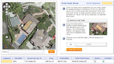
Global Warming and the Climate

Roofray
screen shot of Roofray
Have you ever thought about adding solar panels to your house? Roofray can help you decide. Roofray is an amazing tool built on Google Maps that can calculate the solar energy potential of your house.

To do this you start by simply tracing a a polygon on top of the Google Map satellite image of your house. When you have traced your roof you then drag a marker on the map to show the direction your roof slopes. The next step is simply to enter the angle of your roof tilt.

Once you have entered your details Roofray calculates your month-to-month photovoltaic output levels based on your coordinates and regional characteristics such as the average weather cycle, cloud cover, surface albedo, and the orientation and area of your solar array.

Check out the video below for more information:


Global Sea Level Rise Map
screen shot of the global sea level rise map
This sea level rise map provides a visually striking view of which areas in the world might be flooded if global warming continues. It is possible to select the seal level rise you wish to view from a simple drop down box. The map will then overlay map tiles to show which areas of land would now be under water.

After using this map you will probably want to visit the Roofray map.

National Weather Service Enhanced Radar Image (dead link removed)
screen shot of enhanced radar image
This map has nothing to do with global warming but it is a great way to view precipitation on Google Maps.

The National Weather Service uses radars to measure precipitation. This Google Map mash-up then displays the echo intensity (reflectivity) measured by those radars. The "reflectivity" is the amount of transmitted power returned to the radar receiver.

Base reflectivity images can be used to detect precipitation, evaluate storm structure, locate atmospheric boundaries and determine hail potential.

________________

Sunday, August 17, 2008

Olympic Heat Maps

Today I've been playing with Google Spreadsheets' Heat Map gadget and the Olympic Gold Medal table. For the tables below I looked at the 15 countries with the most gold medals in this Olympics as of 11am GMT today.

The first heat map is based on the number of golds won by each country:

heat map of gold medals

As you can see when you look purely at the number of gold medals won by each country China and the USA are a long way ahead of the rest of the field.

However things change very quickly when you look at the number of gold medals divided by a country's population.

This heat map is based on the number of gold medals divided by the country's population:

heat map based on population

When you look at gold medals as a percentage of population China suddenly is bottom and the USA 12th of the 15. Slovakia followed by Australia and then Great Britain now head the table.

Finally this heat map is based on the number of gold medals divided by the country's GDP:

heat map of gold medals by GDP

When we look at the gold medals divided by a country's GDP China jumps up the table again, coming third behind the Ukraine in first place and Romania in second. The USA comes in 12th of of the fifteen countries when you examine the tables in this way.

If Michael Phelps were a country he would currently lie joint sixth in the gold medal table and top the population table. I don't know Phelps' GDP but fully support the idea of him becoming a country in his own right.

The data for the gold medals was taken at around 11am GMT 17th August. The population and GDP data was taken from Wikipedia.

Update:

Ouseful has created a Google Spreadsheet of the medal table using a ‘live’ feed for the data. The table includes four heat maps for gold, silver, bronze and total medals.

________________

Saturday, August 16, 2008

Beijing Olympics Marathon Route

Beijing Olympics Marathon Route (dead link removed)
screen shot of marathon route
I am currently watching (well it is on television in the background) the women's marathon at the Beijing Olympics. A couple of minutes after the start of the marathon I thought it would be interesting to follow the route on Google Maps.

I then thought it would be even better if I could follow the route in the new Google Earth browser plug-in. In theory it should be easy.

So I added a few lines of code to the map and then tested it in a browser. Unfortunately, as a couple of people have commented on this site in the last couple of weeks, there is a discrepancy between the Google Map tiles and the Google satellite imagery for Beijing. Because the kml was built on Google Maps when you run the kml in the Google Earth browser the route is slightly out of kilter. Therefore I had to create my own My Map and redraw the route.

It is now an hour into the marathon and the map is finished. I can now follow the route in the Google Earth browser.

The athletes have an hour head start on me but I think I can catch them up before they reach the finish line. Ready ... Go!

________________

Friday, August 15, 2008

Lots More Crime on Google Maps

Met Crime Mapscreenshot of the Met Crime Map
The London Metropolitan Police have released a crime map of London. The London boroughs are colour-coded to show how crime rates in each borough compare to London's average.

The Met Crime Map is currently still in Beta and is a reasonable first effort. I particularly like the feature that shows whether crime in each borough has fallen or risen year-on-year. Unfortunately, however, it suffers from the UK police's continuing refusal to release location data about individual crimes. Therefore the map only shows crime data on a ward by ward basis.

If that is all the map is going to show then it compares unfavourably with The London Profiler. The London Profiler only shows crime on a borough by borough basis as well, because it has to work from the Met Office's statistics, but The London Profiler allows you to sort the data by different types of crime. Currently The Met Crime Map only shows burglary, robbery and vehicle crime and doesn't let you differentiate between them. Hopefully they have plans to map other types of crime.

Via: Mapperz

London Knife Crimescreenshot of London Knife Crime
In the UK there has been a spate of knife crimes. This map from SpotCrime geo-tags knife crimes in the capital. Each of the crimes is summarised under the map and clicking on a tag reveals a link to more details about each individual knife crime.

SpotCrime provide crime maps for 130 US cities and have recently added 10 Canadian cities to their ever growing coverage of crime.

Update: SpotCrime have contacted me today to point out another feature available on their site. By adding the crime id's of individual crimes to SpotCrime's url (with comma separation) you can create your own map featuring only the crimes you have selected.

For example, http://www.spotcrime.com/crimelist/1688972,1688974,1688973 is a map of just three crimes in Hatfield, UK. If you check out the map you will see that all three crimes are very similar, all take place within about one mile of each other and all take place at a certain time of night. This is another feature that the Metropolitan Police should add to their map.

Hidden: On the Trail of a Bank Robber (dead link removed)
This Google Map mash-up from the Charleston Gazette charts the interesting story of serial bank robber Roy Plummer.

Roy Plummer robbed at least 14 banks in the 1980s. He fooled, among others, his first wife and baseball star John Kruk. The map shows the banks that Plummer robbed and a few others that the FBI believe he robbed as well.

________________

Friday Fun on Google Maps

They Might be Giants
Actually no - this is Ned Kelly.

Via: Street View Fun

I Bought the T-Shirt
t-shirt designs from Zazzle
These t-shirt designs are available from custom t-shirt company Zazzle. Hmm.. copyright issues?

Google Maps Cloning

Photoshop Disasters has discovered this Google Map satellite view, which does look like a clear example of clone stamping in Photoshop (check out the similarity of the white trees). The comments to the post on Photoshop Disasters suggest some very plausible theories as to why Google would clone this imagery, for example, covering up a nuclear attack, covering up a black hole, covering up the Super-Secret Treehouse Lair of Cooldom, the Giant Trojan Clog the Dutch are developing to invade Belgium.

America's Drunkest Cities
screen shot of america's drunkest cities
It's Friday so you might be planning a little drink tonight.Or, if you live in one of the cities featured on this map, you might be planning a bigger drink.

The America's Drunken Cities map is from the prolicic Google Mapper Virender Ajmani. Virender also had time this week to develop:

The Detroit Mayor Map - Detroit mayor Kwarme Kipatrick has been in a little trouble lately. This map follow the media's reaction to his exploits.

Beijing Olympics Map - This map shows the latest Olympics videos posted to YouTube automatically geo-tagged on a Google Map.

Russian and Georgian Conflict - This map tags YouTube videos posted on the present conflict in Georgia.