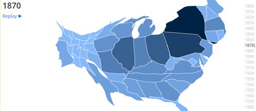
Perhaps one of the best mapped illustrations of this westwards shift in the U.S. is this animated cartogram. In general I'm not a huge fan of cartograms but this animated cartogram, showing US Population Trends Over The Last 220 Years, perfectly visualizes how the mean center of the U.S. population has continually moved in a westerly direction.
The map shows the size the population in every U.S. state for every decade since 1790. The animated cartogram clearly shows the general westward migratory pattern of the American people over the last 200 years.

Another neat visualization of the westward migration in the U.S. is this map from the US Census Bureau. This animated map shows where the mean center of the population has been for each U.S. census from 1790 to 2010.
The Mean Center of Population for the United States 1790 to 2010 shows how the mean center of population in the US has shifted westward in the last 220 years from Kent County, Maryland to Texas County, Missouri.

This shift is not only evident in the westerly moving mean center of population in the U.S. but also in the list of the largest populated cities generated from each U.S. census. Josh Mahar has created an interactive map showing the top 10 U.S. cities by population in every census since 1790.
Using the Historical Look At America's Largest Cities map you can view the top ten most populated cities in each decade. The map sidebar also shows the population for each of the top ten cities in each census. If you turn on the annotations you can also find out a little more about the changing populations in the mapped cities.
Last week I released a very similar map called Shifting Cities. In essence my map visualizes the same data used in Josh's map. Both maps show how the most populated cities in the U.S. are increasingly likely to be found in the west and south of the country. However Josh's map is better than mine. His annotations are more detailed than the notes on my map. I also like the fact that Josh has used scaled map markers to show the relative population size of each city shown on the map.

No comments:
Post a Comment